First impressions with Big Sur
Apple, you continue to surprise me. I’m being serious; I was genuinely thrown off-guard with macOS Big Sur this year as my friends and I watched the WWDC 2020 livestream keynote on Monday.

Apple, you continue to surprise me. I’m being serious; I was genuinely thrown off-guard with macOS Big Sur this year as my friends and I watched the WWDC 2020 livestream keynote on Monday. This year’s conference was definitely a significant one, and it felt Mac-centered rather than focusing more on iOS and iPadOS like last year. The new iOS and iPadOS updates are great as we finally see widgets (Windows Phone-style) and options to set the default web browser and email apps.
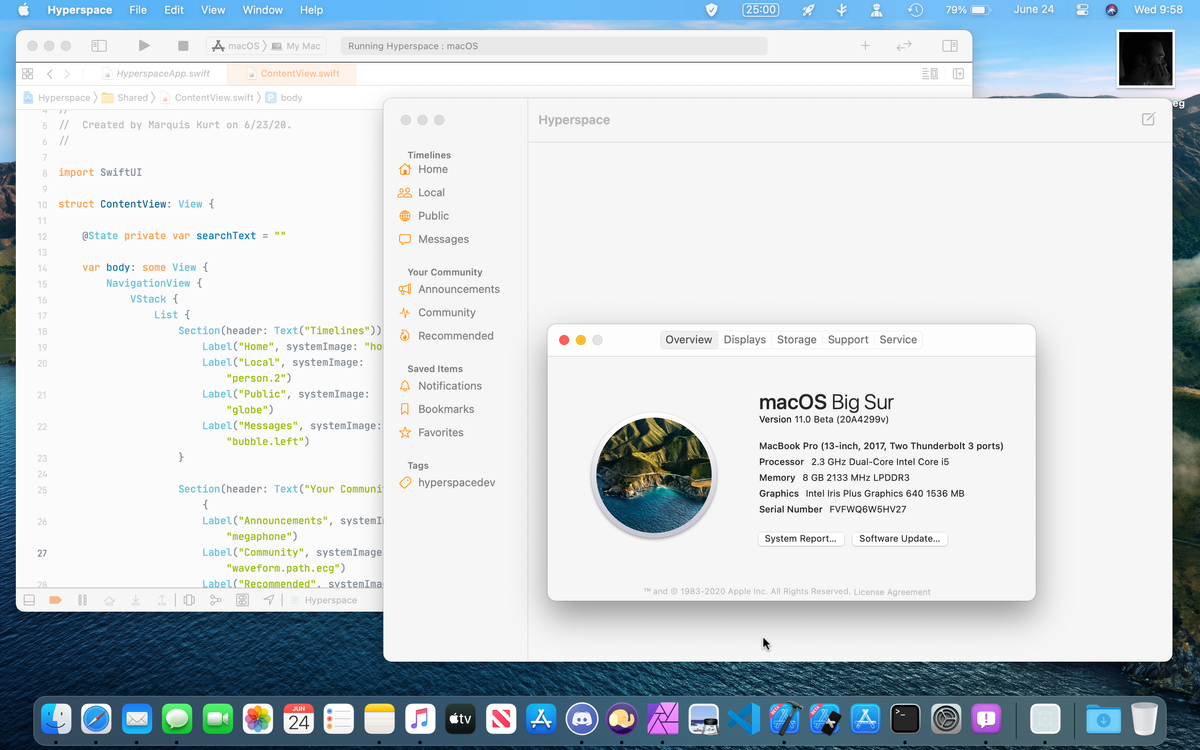
However, the biggest thing that caught my eye was this year’s update to macOS, the desktop operating system that I’ve used for years alongside Linux and Windows. Initially, I expected some bug fixes and the big announcement that Apple would be transitioning to their own ARM-based processors instead of Intel’s. Thankfully, I’ve seen the latter of my expectations, and I’m super excited to see how it will play out. Besides this, Apple has presented and showed us something that I didn’t truly expect: macOS Big Sur. macOS Big Sur (version 11) is the latest update to macOS, and there are some major changes to the OS. After seeing some initial feedback on both Mastodon and Twitter about its stability and relaiability, I figured that I’d back up my stuff and give it a spin. This also gives me an opportunity to work on another project…
Design

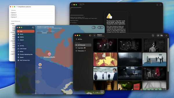
The biggest visible change to macOS Big Sur is the all-new redesign of the system. The menu bar is more translucent than ever, everything feels more relaxed in spacing, and the iconography has changed significantly. Finally, those awkward window controls in the Music app makes sense! The gradients of the older Aqua interface have disappeared in favor of flat controls and spaces, and the icons take on a look that is visually similar to iOS and iPadOS for years. I know that a handful of people aren’t a big fan of these new icons, let alone the Messages, FaceTime, and QuickTime Player icons, but I think this is alright to have some form of consistency in icons across all platforms. Though I am slightly annoyed this happened a week after I designed new icons for Unscripted, I’m not really bothered by these icons as much.
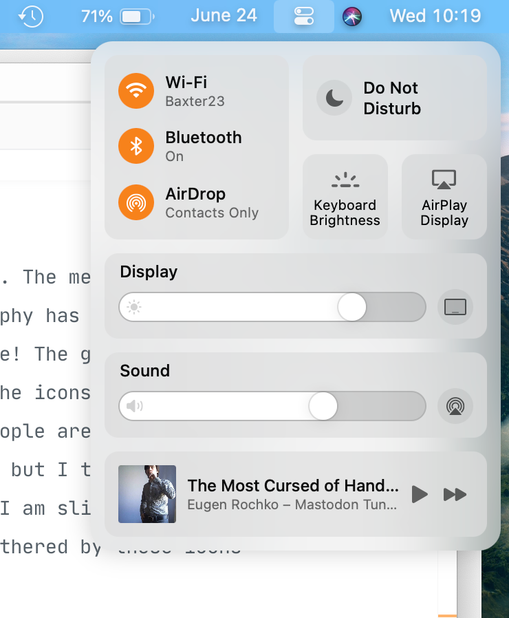
Another change is the inclusion of the new Control Center in macOS, which is built in SwiftUI from my understanding. I’m glad the control center is finally on macOS since it means I can clean up my menu bar a bit by letting the WiFi, Bluetooth, and sound controls rest in one place rather than taking up space in the menu bar. I’ve been using more menu bars apps in the past few months like StatusBuddy, Maccy, and Flow, so this is a welcome change. I’d love to see customizability of the Control Center in the future like on iOS, but this suits me fine.
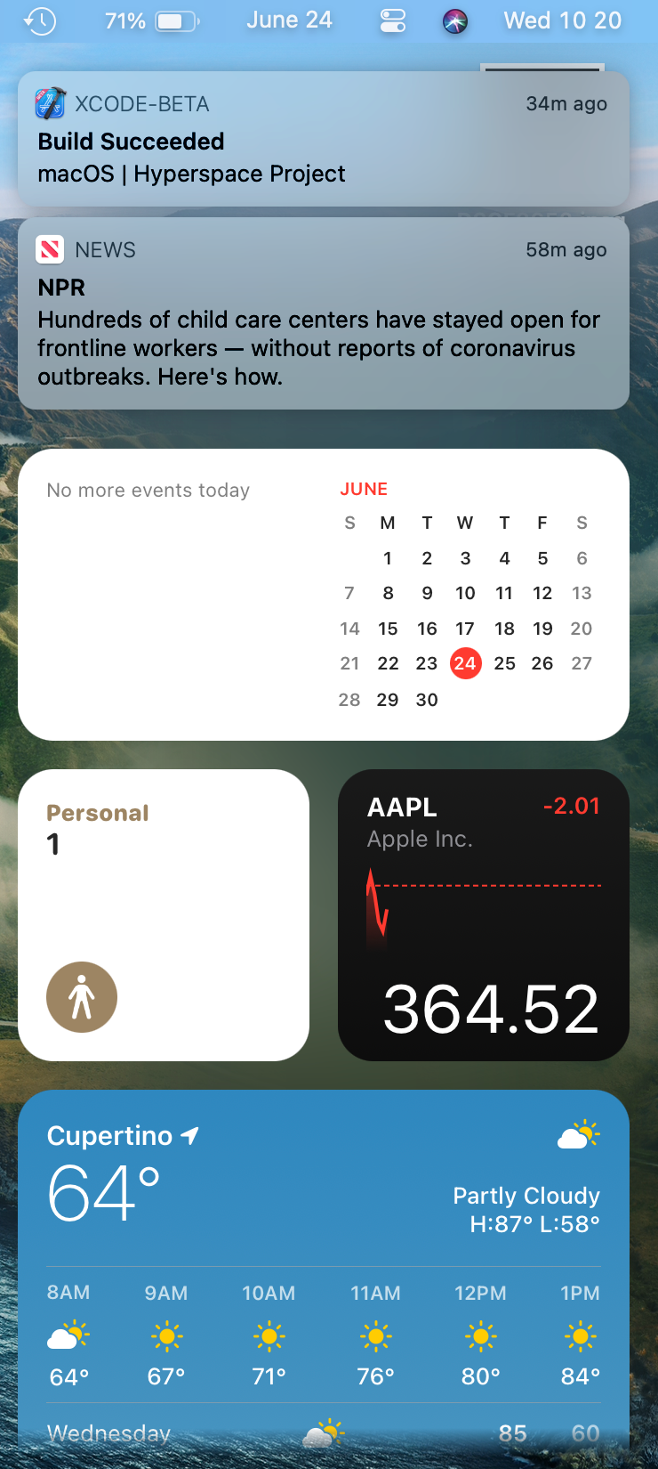
The Notification Center has been completely revamped and uses the new widgets from iOS/iPadOS 14. The notifications also take on an iOS-esque appearance, keeping things consistent. So far, the widgets are pretty good and notifications look sleek. I also love how, when I’m in full screen, these notifcations fade in instead of a slide animation; I noticed this when I was playing the new Minecraft 1.16 with my friends last night. My only major complaint about this notification center as of right now is that clicking the time in the menu bar to access isn’t always 100% responsive. It takes me a few clicks to get it to pop in, but I imagine this will get fixed in the future.
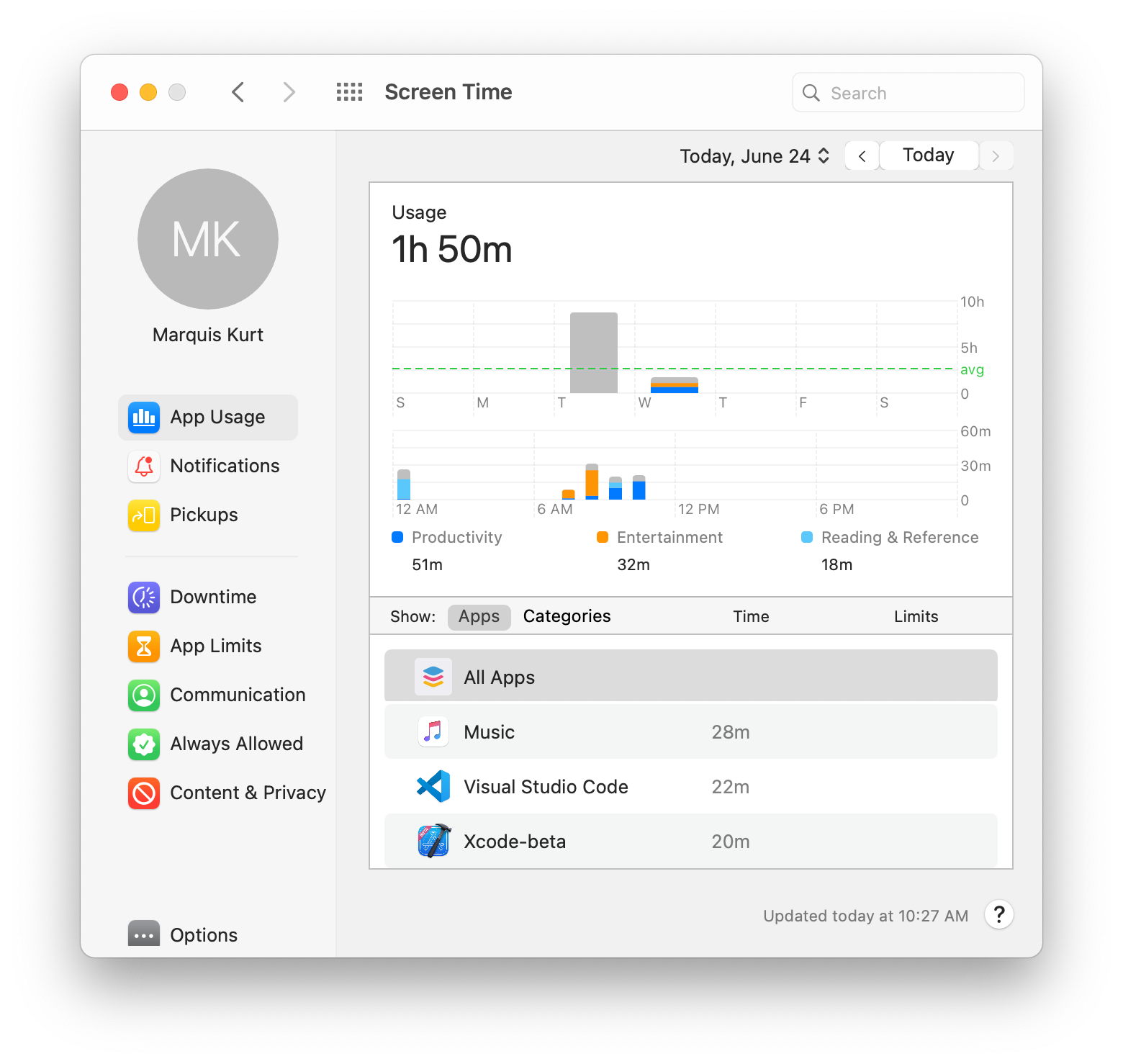
Considering how far this redesign has gone, Apple’s seem to have nailed a lot of areas. However, there are some spots where this redesign hasn’t been completely refined, and it looks kind of awkward. Take the Screen Time section in System Preferences, for example. The new padding on the left side for list items just doesn’t seem to work correctly, and it feels rather cramped like someone was trying to shove the sections in there and not consider wrapping (I’m looking at you, Content & Privacy).
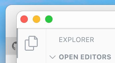
And as for windows that don’t use the new style with the toolbar, the window controls look a bit too close to the edge. I don’t know what it is, but these window controls here feel… off… It almost feels like these controls are ready to just take a dive right off the titlebar and into the ocean.
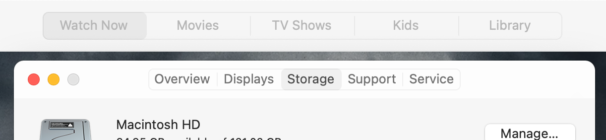
And for some reason, this same thing happens to tab groups in different apps. For apps like TV, Podcasts, etc., it looks just fine as I would expect. Go to the “ > About This Mac” window, though? Cramped. I don’t get it. At least the window controls here are fine sitting at the top and not wanting to think about scuba diving in the deep blue sea 😅.
I could go on an on about these design inconsistencies in some places, but I don’t want to spend too much time talking about it. That’s more of a job for Martin Keary (Tantacrul), and this is only the first developer beta; of course it’s going to look incomplete for the time being. With that said, the overall design of macOS feels extremely nice and fits in line with its younger brethren.
Safari
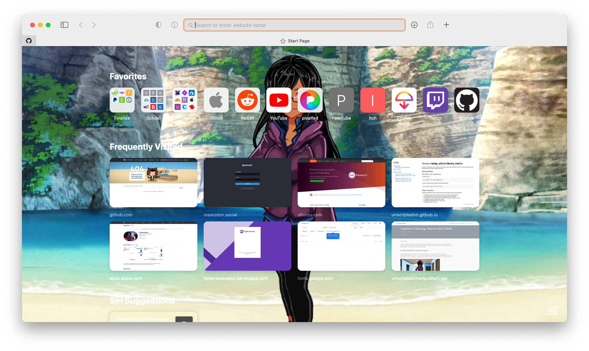
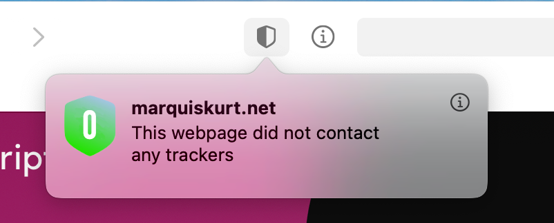
The latest updates to Safari are absolutely amazing. In a way, they took some of the parts I liked about the latest iterations of Firefox and made it work in Safari (and, hey, no expanding megabar). There’s a new customizable homepage which lets you access your favorites, frequently used websites, Siri suggestion, and others. This homepage also lets you set a custom background to give it a little flavor; take notes, Mozilla. Tabs now have favicons displayed by default and have a preview when you hover over them. Extensions in Safari now have WebExtension API support, making it easier to bring extensions from Chrome and Firefox over. Safari also now lets you know what trackers it blocked and gives you a privacy report, similar to what Firefox does.
There’s also some other features and design tweaks to Safari like the translation abilities, but I’m already pleased as it is with all of the features I have mentioned before. Safari has been my go-to browser alongside Firefox, and I’m glad I can enjoy some of the things I liked in Firefox inside of Safari.
The transition to ARM
The biggest thing that strikes me the most about this release is that this will be the first version of macOS to support Apple’s own silicon, which makes me excited. I’m anticipating some struggles at first because some of the apps I use rely on other frameworks like Electron and Ren'Py, so I’m waiting to see how they will adopt the ARM transition; luckily, Apple’s bringing back Rosetta to make translation a bit easier. Otherwise, I’m excited to start building universal applications and building native apps for Apple’s silicon.
I’m also impressed by the timeline and process that Apple has outlined to make this transition seamless. Granted, Apple has done these transitions in the past before with the move to Intel from PowerPC, but I’m still impressed and grateful that Apple has laid out the plan in its entirety. This kind of communication is extremely important, and I’m glad Apple’s taking the time to do so. Now if I could get my college to do the same 😂.
Other small tidbits
There’s also some other things about this first beta of Big Sur I’d like to note:
- I love the new sounds. They’ve been refreshed and sound modern.
- I noticed that the Mail app hung with my existing inbox. Deleting my old mail stuff from
~/Library/Mailand letting Mail sync it back seemed to do the trick. Whoops… - The Background Music app I used before this kind of just stopped working correctly once I installed Big Sur. Thankfully, the new Control Center made it somewhat outdated for me.
- The abstract wallpapers in this release don’t seem to work correctly and point to the old Catalina wallpapers. Though the new Big Sur wallpapers are nice!
- Xcode 12 beta seems to crash a lot when I go into the Accounts section of the settings after I signed in with my Apple ID. Not sure what’s happening there, but I hope Apple’s received the plethora of crash reports from it.
- Messages is really nice and powered by Catalyst, but I can’t seem to use my Unstickered pack that I made. I’m not sure if this is even supported, so I’m waiting to see what happens and hope that the new forums bring this to light.
- iWork hasn’t been updated to match the new styles yet, but I imagine this will happen much later in development.
- Spotlight has also been redesigned slightly, and it looks pretty good. Also feels a lot more responsive.
- The Music app feels a bit more polished, but there’s still some old iTunes bugs in there.
- I love the new Finder. It feels a lot more modern, and I can have an AirDrop button.
Final thoughts
This is the first developer beta, and there’s obviously room for improvement. Despite this, macOS Big Sur is a nice update and it feels great to work in. I hope to have a more thorough review of Big Sur after playing around with it for a month, and I can’t wait to get Hyperspace and Unscripted to work well with the new update, and I’m excited to be working with SwiftUI again to, hopefully, make an Apple-specific version of Hyperspace to everyone (codenamed “Starlight”).