Liquid Glass is a beautiful work-in-progress
Alongside all the major updates to Apple’s operating systems this year, Apple unveiled a new, refined design for them called “Liquid Glass”. The design is enjoyable, but there’s room for improvement.

Hey, listen!
This post is part of a series of posts I intend to write about everything announced at this year’s WWDC.
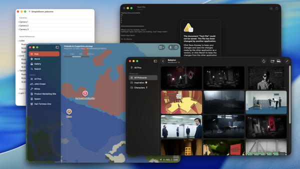
Alongside all the major updates to Apple’s operating systems this year, Apple unveiled a new, refined design for them called “Liquid Glass”. This design works across the entire set of Apple’s platforms, and it takes on a more glassy appearance, inspired by the UI design of visionOS. While it is not a major redesign (such as with Windows 7 to Windows 8), the changes are substantial.
Redesigns like these tend to be controversial, as a backlash rises from enthusiasts, designers, and engineers alike. When I first saw the Liquid Glass design, I got concerned about potential illegibility issues due to lack of contrast in a few areas. However, I followed up with additional videos such as “Meet Liquid Glass” and “Get to know the new design system”, and I got to play with the new design in an iPad simulator. After those experiences with Liquid Glass, I observed the following:
- The demos in those design session videos showed much more legible variants of the designs that were demoed on the opening keynote.
- A majority of the legibility issues appear to stem from a bug where it can’t accurately pick the correct contrast at the right moment. Sometimes, it takes a half-second before it works correctly. Otherwise, the design is legible, and contrast ratios were acceptable.
I had the opportunity to prototype a new design for Alidade using Liquid Glass, and while I plan to talk about that in a later post, I will admit that it was genuinely enjoyable to work with the new design. The animations, fluidity, and flexible nature of Liquid Glass are a spectacle of their own, and building with it is a delight. While the previous design was acceptable and functional, it didn’t strike the same way as Liquid Glass does.
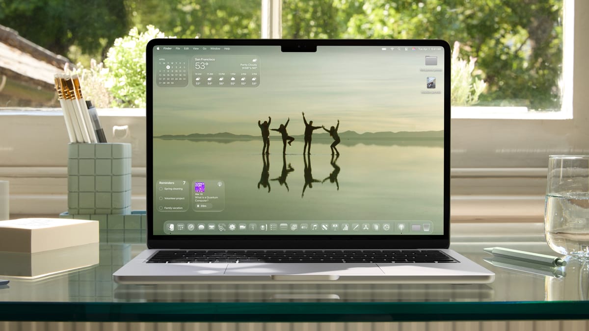
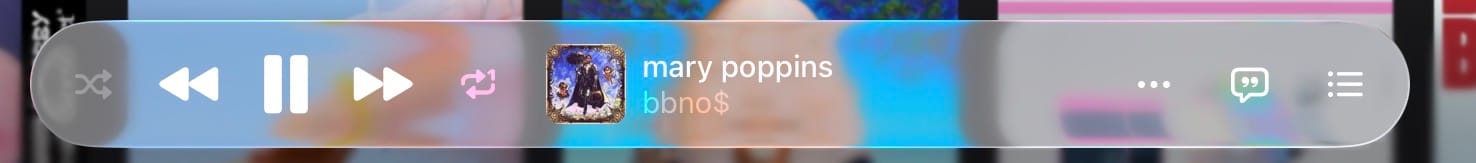
That said, there’s room for improvement. On the Mac, for example, there aren’t as many animations, making Liquid Glass feel... static. Likewise, there are areas where Liquid Glass is unreadable, such as in the Music app. We’re looking at the worst case scenario right now, and it will get tweaked until we get something that matches more closely to the original designs. Like they did with iOS 7, Apple will adjust and iterate on the design to ensure it’s legible.
Liquid Glass is an exciting new design update, and I’m looking forward to seeing how every app on iOS and iPadOS takes advantage of it.